
Just the Tip
Earlier this month Colorado launched it's new brand. Why they needed a brand is not known. Other than the fact that others have done it (and why not?). An investment of nearly a million dollars netted a staid and boring icon and a tagline.

The new brand has not been well received by the state's residents so far. But the state's CMO is hopeful and expects people to come around in 6 months to 3 years after they get used to "seeing it on things," as the state prepares to brand products made in Colorado with the new logo and integrate it into tourism advertising.
Some comments were that it "looked like a street sign." Perhaps they should have used yellow instead of green, which after all is the color "owned" by the state of Vermont, in a way. Maybe it will be mistaken as a 'Danger: COBALT' sign, given that Co is the symbol for that element.


Inspiration?
Perhaps one of the most heinous state brands ever is the now ubiquitous and eternally co-opted Milton Glaser piece of 70s crap: The <I Love(Heart) NY> logo.
Replete with the gaudy (even then) American Typewriter Bold, this little turd can be bought on any object or article of clothing in every damn souvenir shop in New York City and beyond. It has even found it's way into the broader lingua fraca with often feeble results. e.g. Why is the company called 'iHeartRadio' when it is meant to say: iLoveRadio. [message and usage lost]
Uncle Miltie revised this bastard child after 9/11/2001 when he felt compelled to comment (and capitalize) on the lives of hundreds to sell t-shirts to the bereft and mourning (I don't care where the money went: bad idea). Clever little smudge there. Genius!

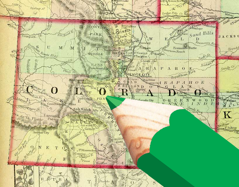
The CO triangle both benefits and suffers for it's own simplicity. I am attracted to and respect it's pared down economy, and yet am disappointed with it's dry utilitarianism.
It essentially looks like the tip of a pencil more than a mountain top.

No comments:
Post a Comment